I knew my energy usage was high and is unlikely to go down as part of this journey, but I want to track how the distribution of that demand changes.
As part of my journey towards reducing my bills and becoming ‘greener’ in the process, I decided to generate some historical charts of my electricity and gas usage, such that when I start adding solar and batteries into the mix, I can track my usage.
I started off with a spreadsheet from ‘Speak to the Geek‘ that he setup for calculating payback against his solar and battery usage.
Many of the tabs are not really used for the calculations on the front page, but looked like a good place to track historical data – the ‘Annual Summary’ and ‘Monthly’ tabs specifically.
I went back through all of my old E-ON energy statements and entered all of the data back to when I signed up with them in 2018 for both electricity and gas, I also added columns for standing charge so I could track the total costs for everything.
Having done this I then generated some charts to show usage and cost over time.
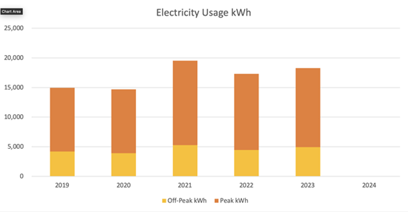
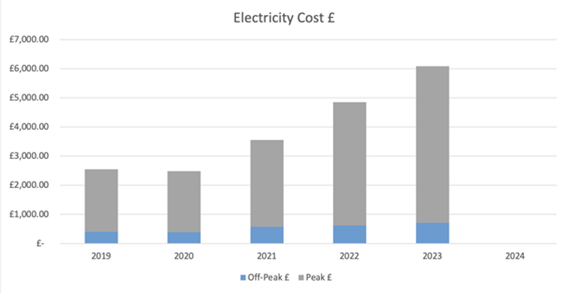
Electricity usage and costs:
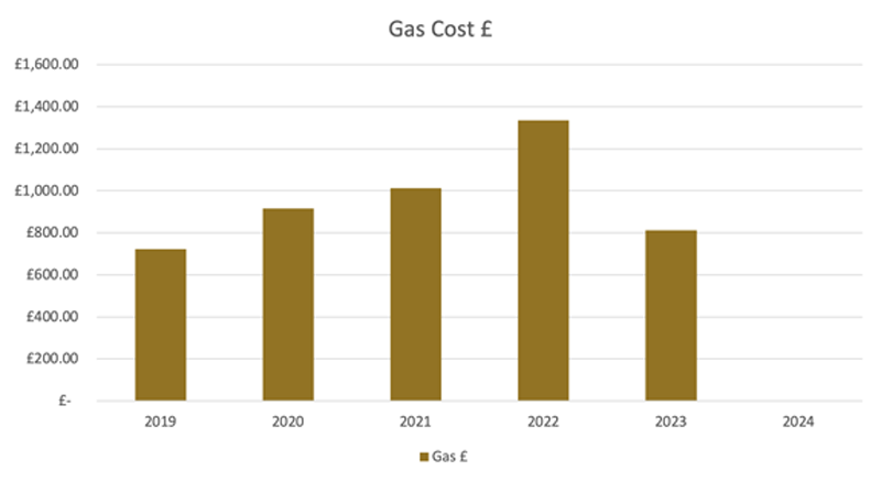
Gas usage and costs:
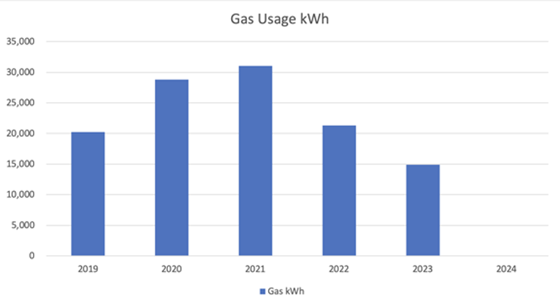
The usage data for both electricity and gas show peaks in 2020/2021 due to Covid lockdown and my entire family being at home (more showers, cooking, heating, etc, etc).
The electricity usage then dropped slightly when my daughter went away to University, however I carried on working from home and added to my networking and server collection.
The gas usage dropped more significantly when my daughter went away as there were then fewer long showers being taken and less of the house to heat combined with some mild winters.
The costs on the other hand have skyrocketed for the electricity but remained somewhat more under control for the gas.
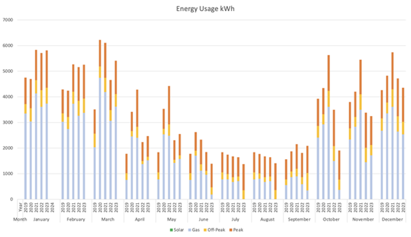
I also decided to trend the various usages over the course of the year.
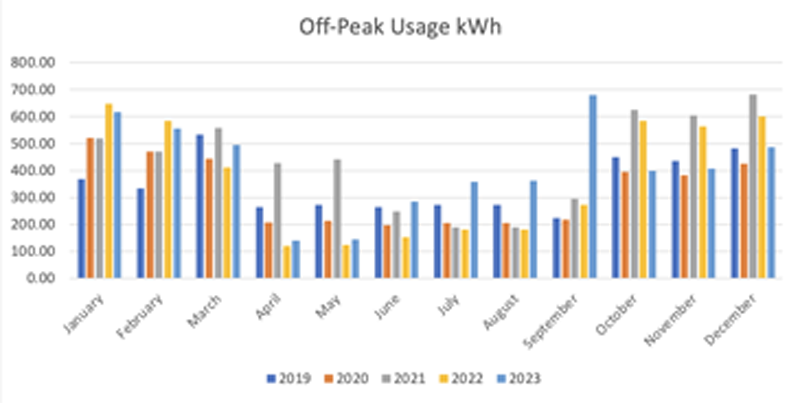
Off-Peak usage
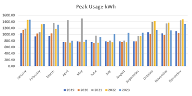
Peak usage
Gas usage
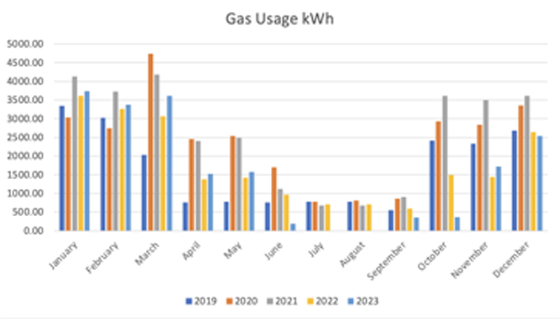
We can see that as expected the gas usage drops during the summer months as I do not need to heat the house.
Peak electricity usage also drops slightly in the summer as we cook fewer hot meals, and washing is dried outside on the washing line, rather than in the tumble dryer.
Off-Peak usage climbs in winter due to people using electric heaters for some additional localised heating.
I then decided to trend all electricity demand

and total energy demand
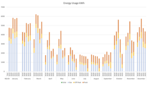
These graphs will also track the solar usage once that starts, so I can see how the demand distribution changes over time as I add more solar, batteries, etc.
I switched over to Octopus Energy at the start of January and shortly afterwards moved to their Intelligent Octopus Go tariff, this alone should save me a significant amount of money due to the peak rate being 7p per kWh lower than E-ON and the off-peak rate being nearly half of the rate from E-ON.
Once I add the solar and batteries, the aim is to shift as much of the usage as possible to off-peak, such as battery charging, and then run off battery and solar for as much of the day as possible.
Now that I am also able to track my daily usage via Home Assistant, I can better forecast how much peak/off-peak I use and when along with how much impact the solar and battery usage will have against the daily costs.
My historical peak/off-peak split is around 75% peak, 25% off-peak, the aim is to try and reverse and improve this in order to achieve a faster payback time.